Have you ever walked into a room and immediately felt a sense of peace—or perhaps a jolt of creative energy? That’s the power of color at work. The choice between a neutral aesthetic and a colorful aesthetic goes far beyond simple decorating preferences. It’s a deeply personal decision that reflects your personality, influences your mood, and shapes how you experience the world around you.
In 2026, the design world is buzzing with a fascinating shift. We’re seeing a move away from “absolute neutrality—cool whites, uniform grays, interchangeable interiors” towards “a richer, more nuanced, and above all more personal approach.” Simultaneously, there’s a growing craving for “bolder, more expressive colors that carry emotional weight.” So, which side of the spectrum truly resonates with you? Let’s dive into the psychology, the benefits, and the practical tips to help you discover your perfect palette.
🎨 Understanding the Neutral Aesthetic
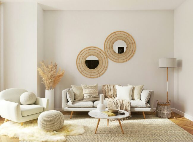
The neutral aesthetic is all about simplicity, calm, and timelessness. It’s a design philosophy that uses a palette of whites, beiges, grays, taupes, and earthy tones to create a serene and uncluttered space. If you’re someone who loves clean lines and open surfaces, a neutral aesthetic likely feels like a breath of fresh air.
What Your Neutral Preference Says About You:
People who are drawn to neutrals often value order, peace, and intentionality. Your space is likely a sanctuary—a place to reset and recharge. According to color psychology, neutrals are low in visual stimulation, which helps “reduce sensory overload and stress.” This suggests a personality that is calm, conscientious, and practical. You might be someone who thinks better in a quiet environment and prefers a “less is more” philosophy, favoring a few things you truly love over a collection of things you merely like.
💡 Pro Tip: A neutral palette doesn’t have to be boring. It becomes sophisticated when layered with a range of tones—from parchment and cream to “greige,” mocha, and espresso. Play with textures like wood, linen, and wool to add depth and visual interest.
🌈 Embracing the Colorful Aesthetic
On the flip side, the colorful aesthetic is an explosion of personality and energy. This style embraces vibrant hues, bold contrasts, and expressive compositions. Think emerald green, cobalt blue, zesty citrus, and bold magenta. If you’re drawn to this aesthetic, you’re likely not afraid to make a statement.
What Your Colorful Preference Says About You:
Choosing a colorful aesthetic often indicates a vibrant, outgoing, and confident personality. People who love bold colors are typically “not afraid to take up space” and are comfortable being different. They tend to be more emotionally open, expressive, and optimistic. If you gravitate towards bright hues, you likely have a zest for life and use color as a way to guide how you want to feel—be it grounded, energized, or optimistic.
💡 Pro Tip: When using bold colors, balance is key. A single statement piece or an accent wall can be enough to inject personality without overwhelming the space. Consider using matte finishes to keep the look sophisticated and prevent clashing.
⚖️ The Psychology: Why We Choose What We Choose
Our color preferences are powerful emotional cues. They mirror our personality traits and subtly influence our confidence levels. Research suggests that our color preferences may actually be driven by our personalities.
- The Need for Calm: If you’re someone who is sensitive to clutter and visual noise, the calming effect of neutrals can be essential for your well-being. Neutral colors create a tranquil environment that promotes relaxation and focus.
- The Desire for Expression: If you thrive on energy and self-expression, a colorful aesthetic can be a powerful form of communication. Bright colors are a way to show the world your confidence, creativity, and unique spirit.
- The Modern Shift: In 2026, we’re seeing a beautiful evolution. The trend is less about choosing one over the other and more about mixing subtle shades with bolder, more expressive color. Designers are embracing hues that “communicate confidence, mood, and individuality.”
💡 How to Choose: Finding Your Perfect Palette
Still not sure which side you’re on? Here are some practical questions to ask yourself:
- How do you want to feel in your space? Do you crave a peaceful retreat (Neutral) or an energizing hub (Colorful)?
- What’s your day-to-day rhythm? If your life is chaotic, you might crave the calm of neutrals. If you’re seeking a spark, bold colors might be just what you need.
- What’s your long-term vision? Neutrals are timeless and offer maximum flexibility. Colorful palettes are expressive and can be easily updated.
✨ The Best of Both Worlds: The Art of Blending
You don’t have to choose! Many of the most stunning spaces successfully blend both aesthetics. The key is balance.
- The 60-30-10 Rule: A foolproof formula for a balanced space: use 60% of a dominant neutral, 30% of a complementary shade, and 10% of a bold accent color.
- Neutral Foundation, Colorful Accents: Keep your big pieces—like sofas, rugs, and curtains—neutral. Then, inject personality with colorful cushions, throws, art, or a vibrant vase. This allows you to experiment with color without a major commitment.
- Colorful Walls, Neutral Furnishings: For a bolder approach, consider painting a wall a rich, saturated color, but balance it with neutral-colored furniture.
🏁 Conclusion: It’s All About You
Ultimately, the choice between a neutral vs. colorful aesthetic is a deeply personal one. There’s no right or wrong answer—only what feels right for you. Your home, your wardrobe, and your personal style should be an extension of who you are.
Whether you find solace in the serene embrace of a neutral palette or express your vibrant spirit through a kaleidoscope of color, the most important thing is that your space feels like home. As we move through 2026, the true paradigm shift is about creating a space that feels personal, nuanced, and authentically you. So go ahead, embrace your aesthetic, and let your true colors shine.
❓ Frequently Asked Questions
1. Is a neutral aesthetic boring?
Not at all! A neutral aesthetic can be incredibly sophisticated and calming. By layering different tones and textures—like mixing a creamy white with warm taupe and adding natural wood and linen—you can create a space that is rich, inviting, and far from boring.
2. Can I mix neutral and colorful styles in my home?
Absolutely! In fact, this is one of the most popular and effective design strategies. Use a neutral base for your large furniture pieces and then add pops of color through accessories like throw pillows, artwork, and rugs. This gives you the flexibility to change your color scheme easily over time.
3. What does my preference for neutral colors say about my personality?
People who prefer neutral colors often value calmness, order, and simplicity. They tend to be practical, grounded, and enjoy a peaceful environment that is free from visual clutter. They are often described as conscientious and sophisticated.
4. What does my love for bold, bright colors say about me?
Loving bold colors often points to a confident, outgoing, and expressive personality. You are likely comfortable standing out, not afraid to take up space, and tend to be optimistic and emotionally open.
5. How can I incorporate more color if I’m used to a neutral palette?
Start small! Introduce color through easy-to-swap items like a vibrant throw blanket, some colorful cushions, or a piece of statement art. This is a low-commitment way to experiment and see how bold colors make you feel.
6. What are the current color trends for 2026?
2026 is all about intentionality and personal expression. We’re seeing a shift towards bolder, more expressive colors like cool blue, bold magenta, and zesty citrus. Interestingly, there’s also a move towards “soft color, layered tones, and quieter palettes that feel personal rather than performative,” with many designers considering mauve the new neutral.